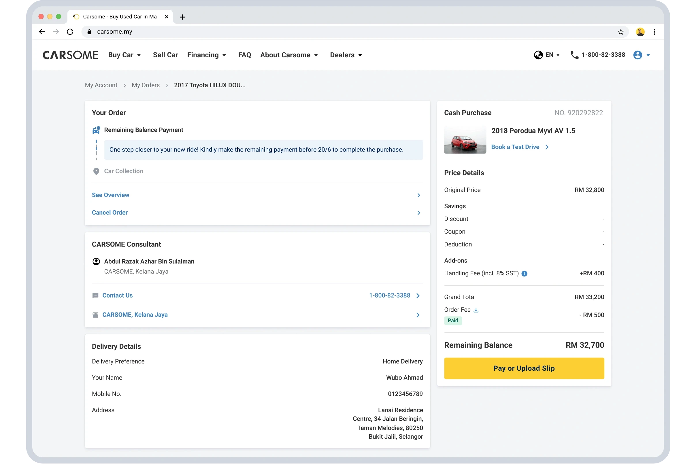
Audit, Design System
Building the Foundation for Scale

COMPANY
Tupai
DURATION
Nov 2025 – Jan 2026 (7 weeks)
TEAM
Product Designer (me), Head of Product, Product Marketer, Graphic Designer, Software Engineer
TL;DR
What began as a DaisyUI customisation project evolved into the creation of Tupai's first design system.
Over 7 weeks, I transformed an off-the-shelf UI kit into a scalable foundation consisting of a tokenised colour system, typography variables, icon and illustration libraries, 46 customised components, and 5 custom-built components.
The system was adopted beyond design, enabling product and engineering teams to prototype and ship new experiences using shared components and tokens.
Jump to Solution
View all

CONTEXT
Tupai is an AI-powered mathematics tutoring platform serving more than 5,000 students across SPM, IGCSE, and KSSR curricula.
The team had purchased DaisyUI for its built-in chat patterns and initially wanted help adapting it to their brand. However, an audit of the product revealed a deeper challenge: there was no shared design foundation behind the UI. Colours were organised by product features, typography lacked a consistent scale, icons were scattered across files, and illustrations had no clear standards.
The challenge was no longer kit customisation but rather, creating the foundations required for the product to scale.
MY ROLE
I was brought in as the sole designer to establish the product's first scalable design foundation.
My responsibilities included:
Auditing the existing product and design assets
Defining the design token architecture
Adapting DaisyUI to Tupai's brand
Building custom components and patterns
Establishing icon and illustration standards
Publishing and documenting the design system for team adoption
I worked closely with product and engineering throughout the engagement to ensure design decisions aligned with implementation realities.
RESEARCH
INSIGHTS
The audit surfaced 4 key areas of design debt:
01.
Colour architecture wasn't scalable
Structured around product categories rather than scalable design tokens.
02.
Typography lacked a shared system
No shared variables for size, weight, or spacing.
03.
Icon usage was fragmented
Inconsistent styles, naming conventions, and sizing.
04.
Illustrations lacked governance
Fragmented assets with no central source of truth.
KEY PRODUCT DECISONS
I focused on building a system that could scale across both design and engineering.
Establishing Foundations
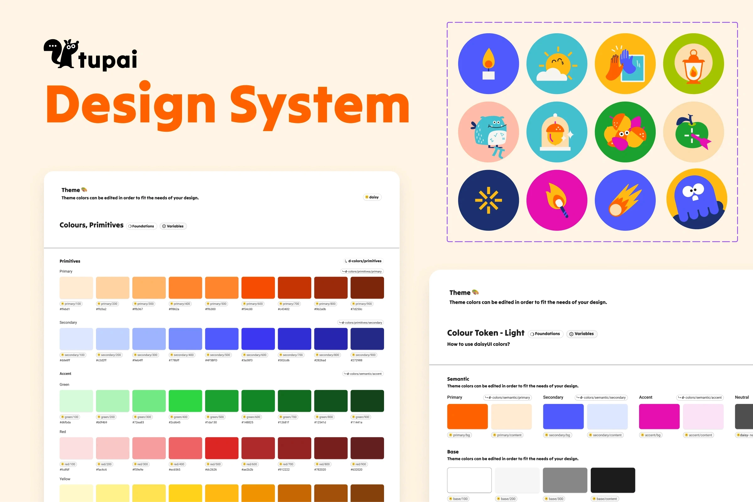
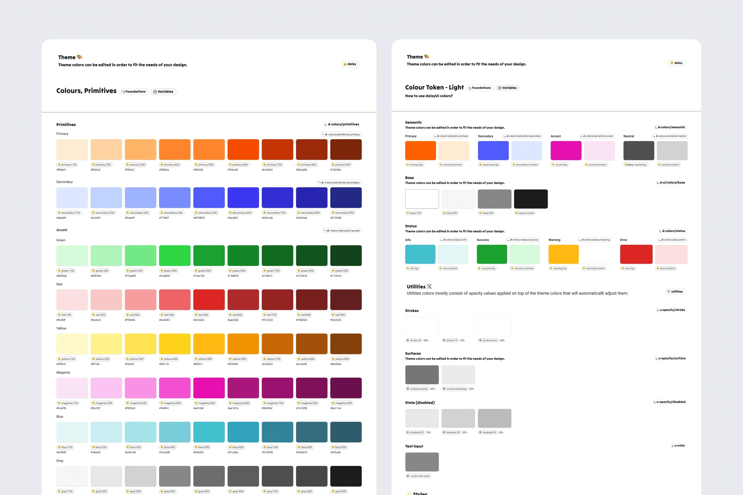
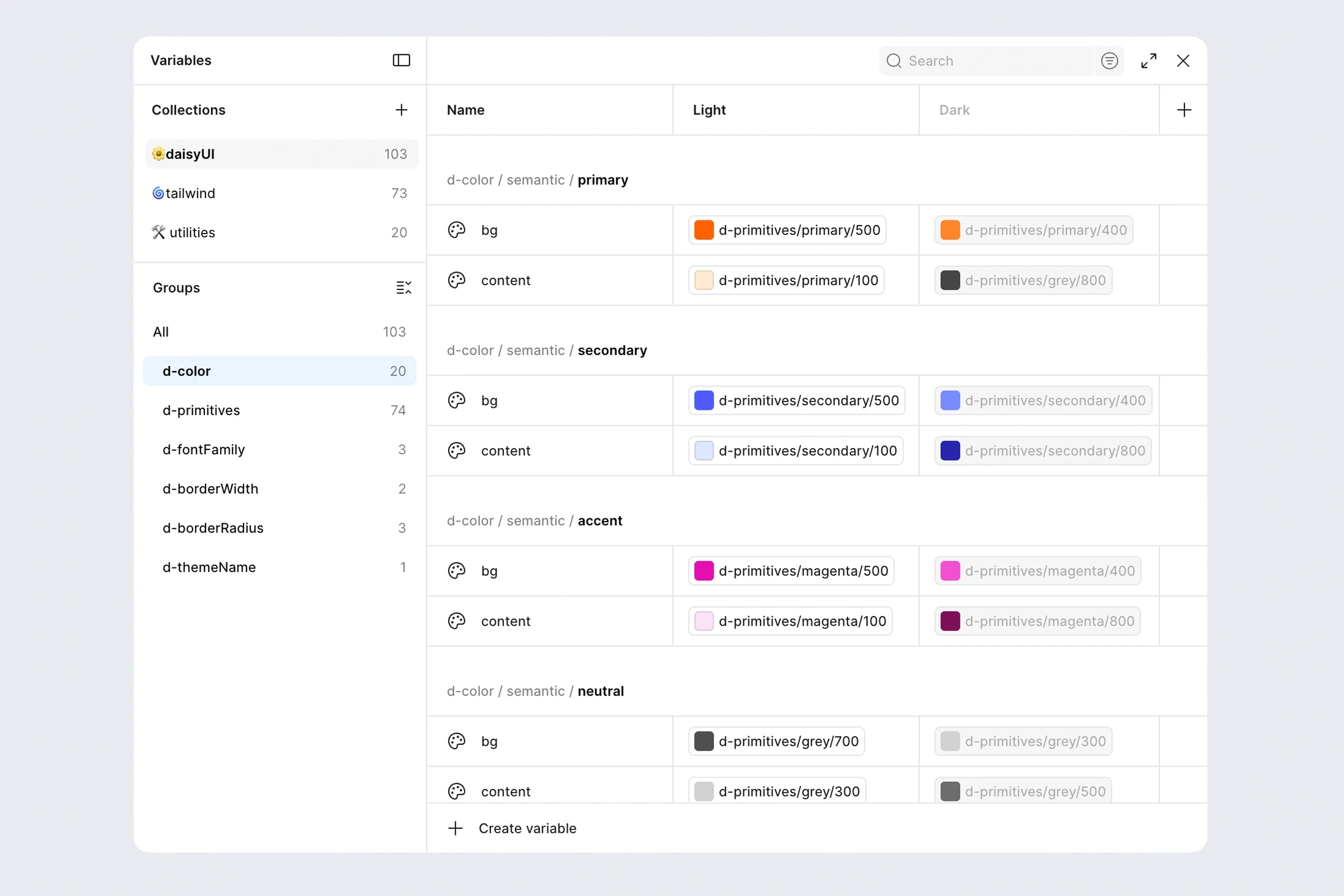
I rebuilt the colour system using primitive and semantic tokens, enabling light and dark mode support while keeping components theme-agnostic.
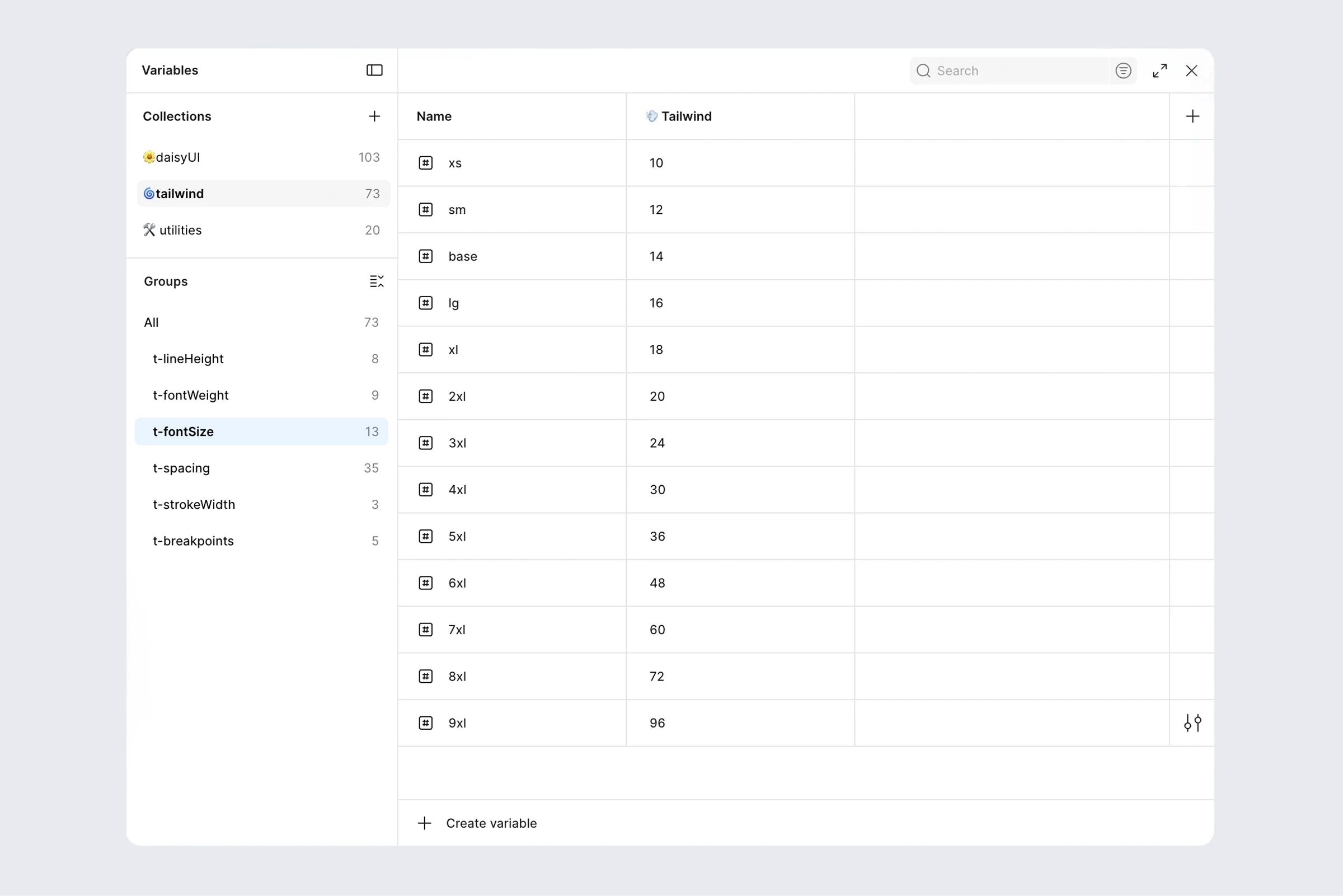
Typography was standardised through shared variables for size, weight, line height, and font family. Working closely with engineering, we aligned the system with Tailwind conventions rather than introducing unnecessary custom scales.
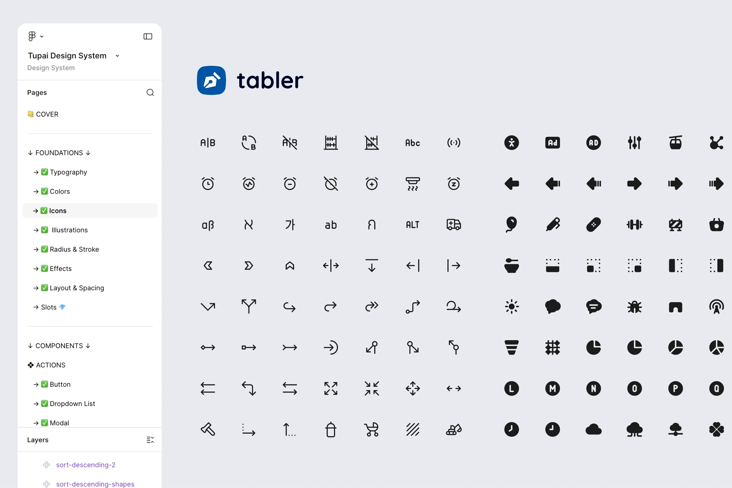
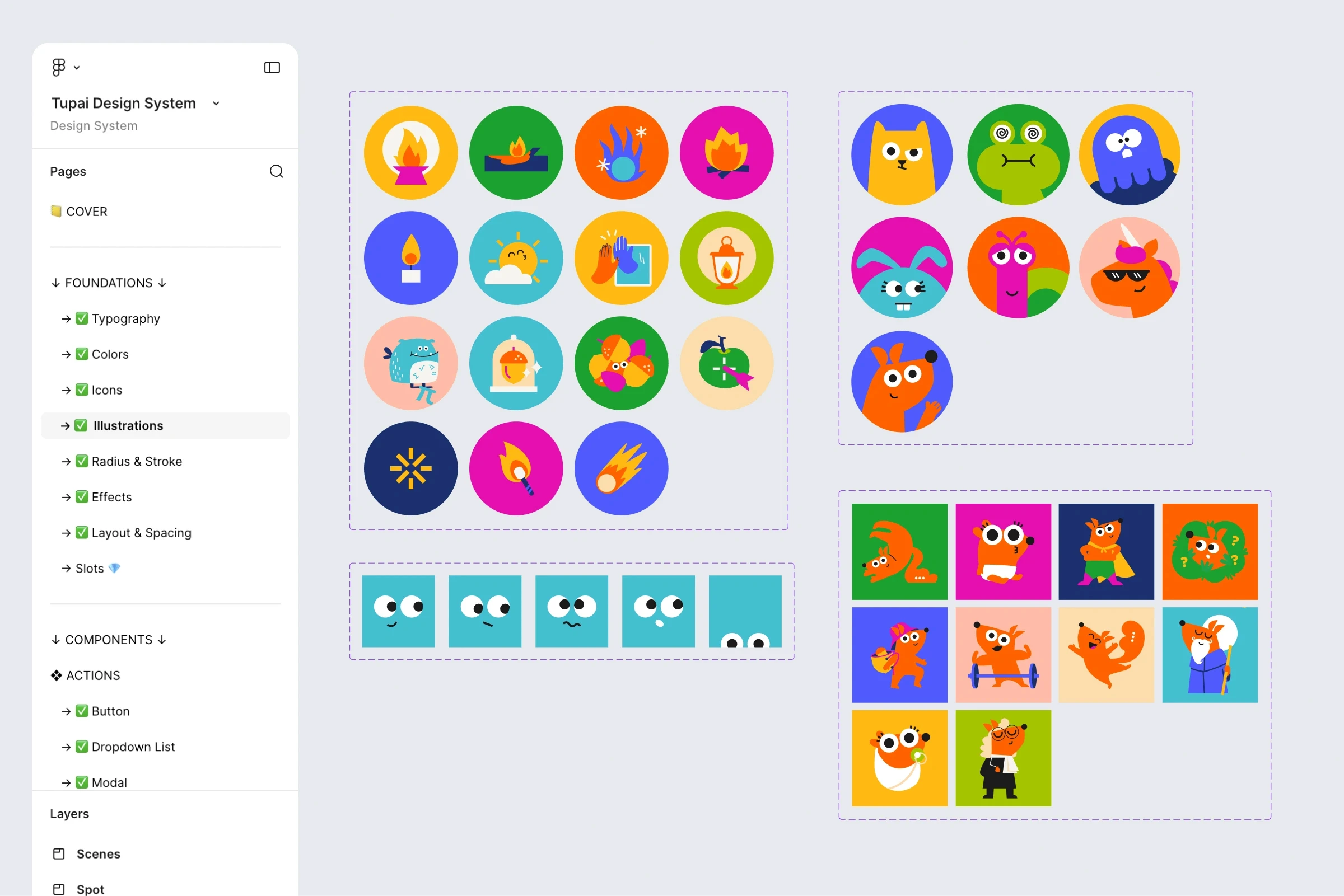
To create a single source of truth, I introduced a unified icon library using Tabler Icons and consolidated all illustrations into a standardised asset library.
Building the Component Library
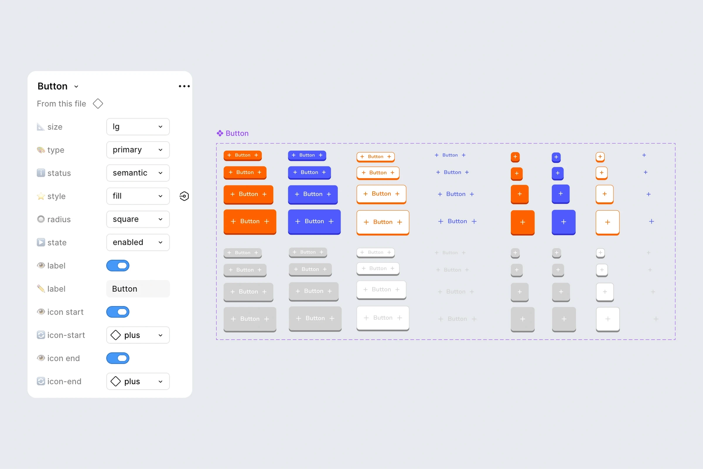
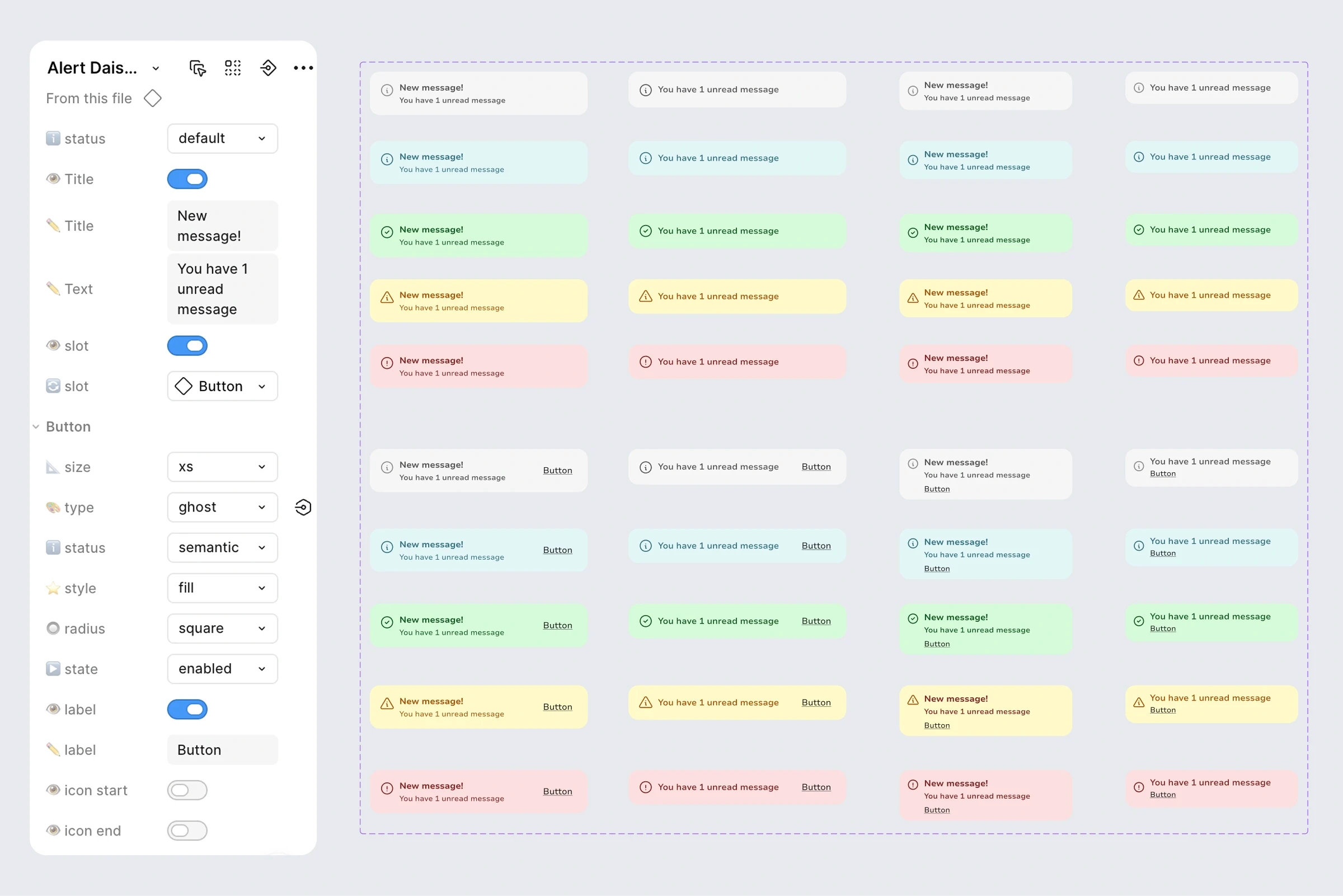
With the foundations in place, I adapted 46 DaisyUI components and built 5 custom components from scratch. Components were built using an atomic approach, allowing reusable building blocks to be combined into more complex patterns.
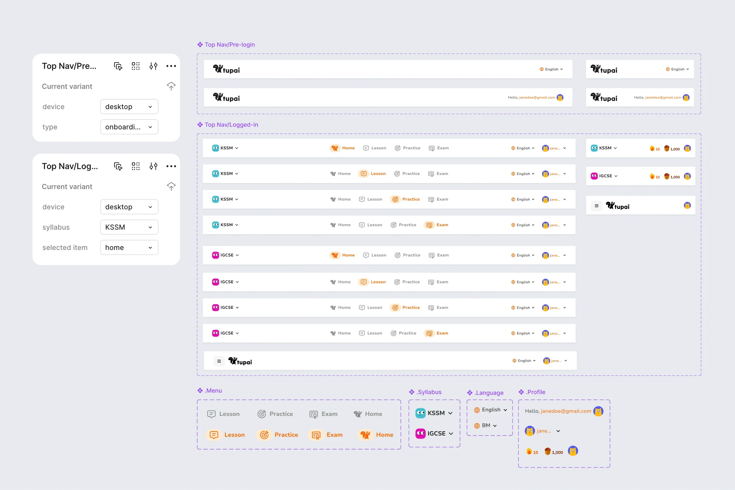
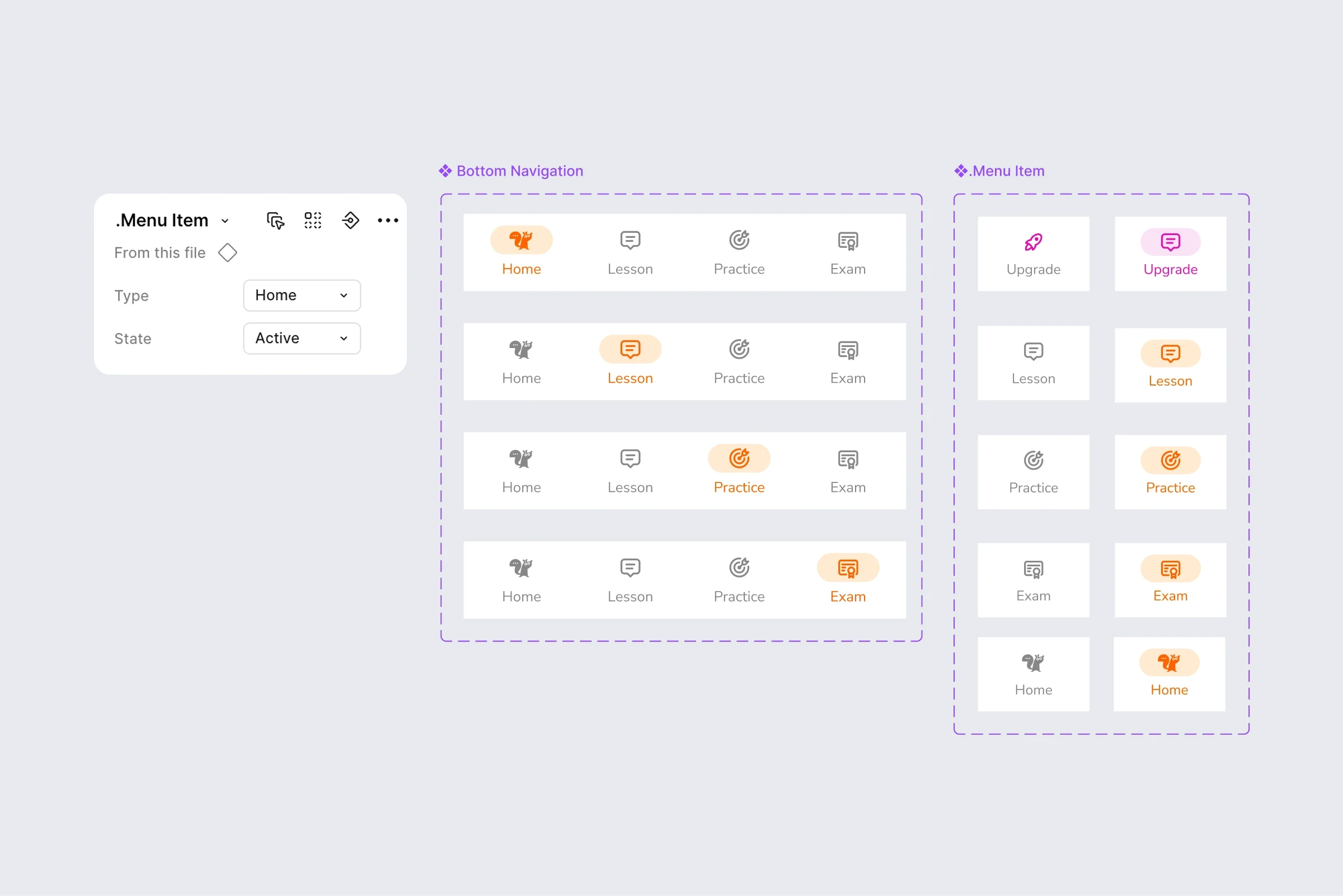
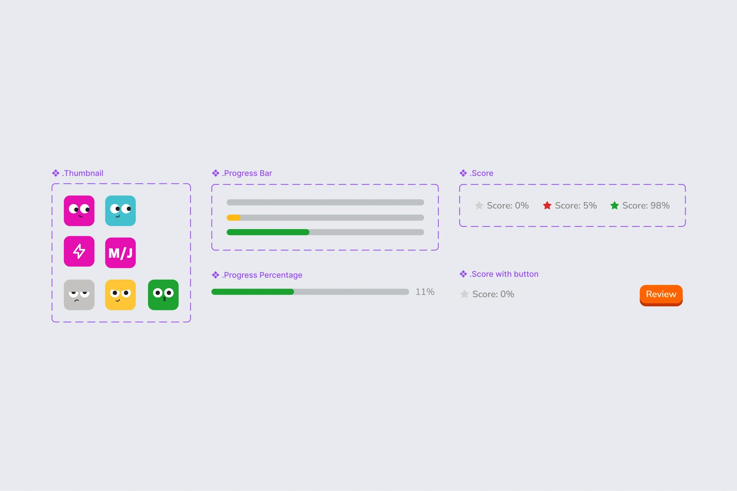
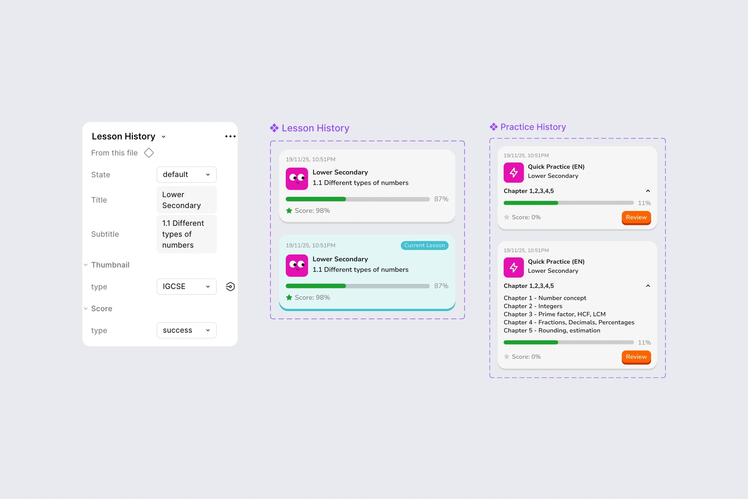
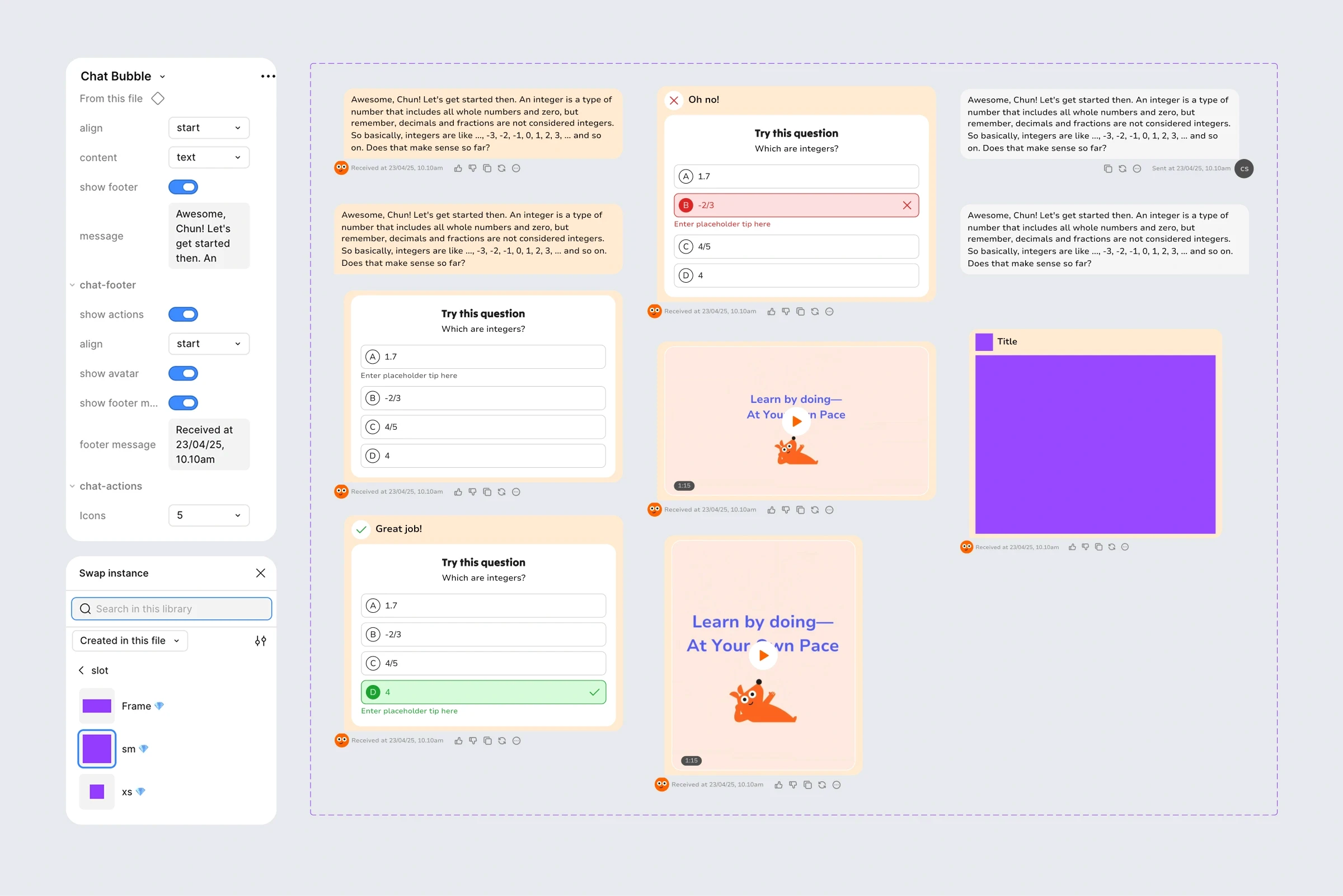
The most complex challenge was the chat experience.
Because learning happens through conversation, the chat system needed to support AI responses, MCQs, answer states, video content, and feedback actions. Rather than creating separate variants for each scenario, I designed modular building blocks that could evolve alongside the product.
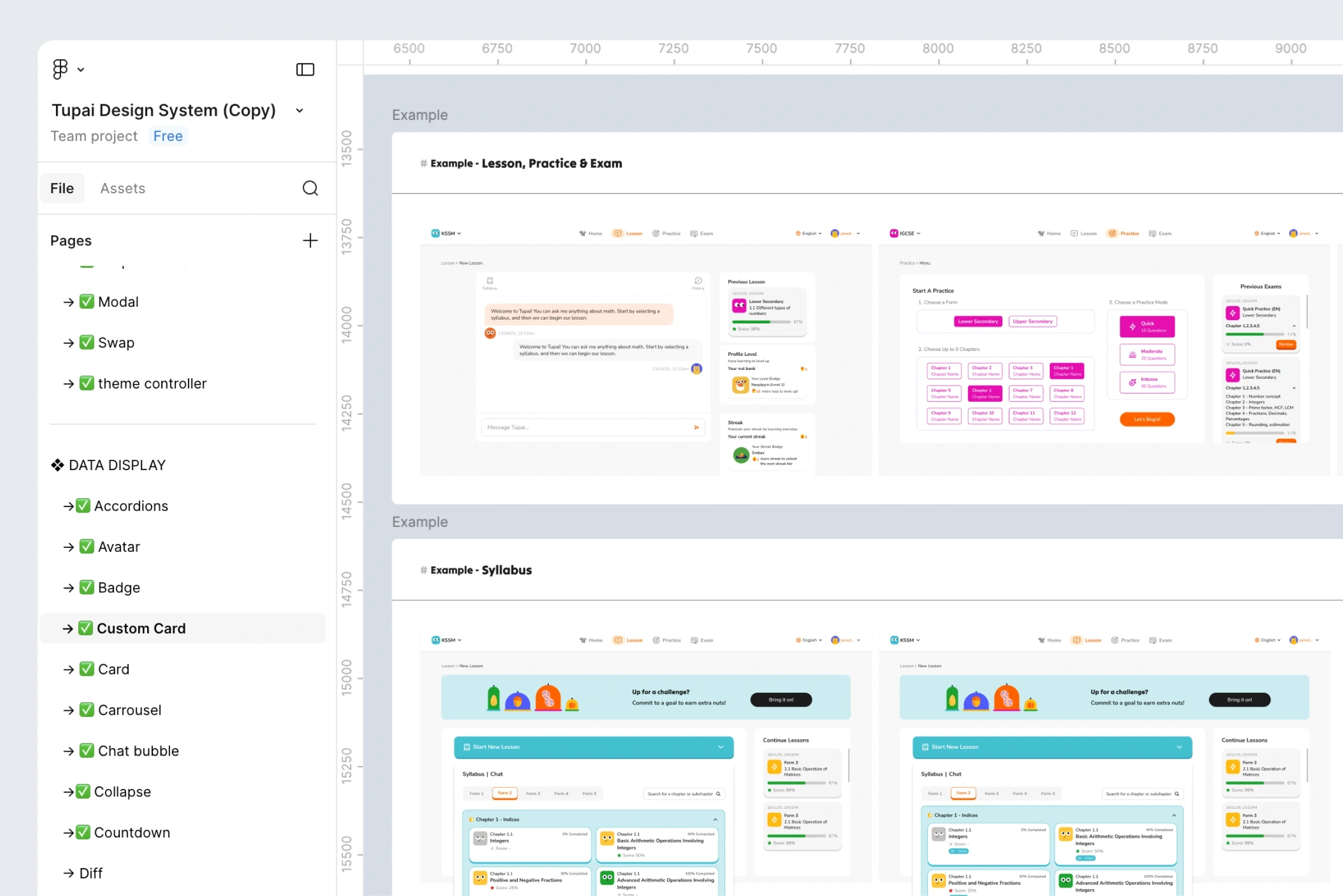
Every component was documented with usage examples to help the team understand not only what existed, but how it should be applied.

IMPACT
51
Components Adapted & custom-built
3 Teams
Using the System
Parent Portal
First Feature Prototyped Via Figma Make
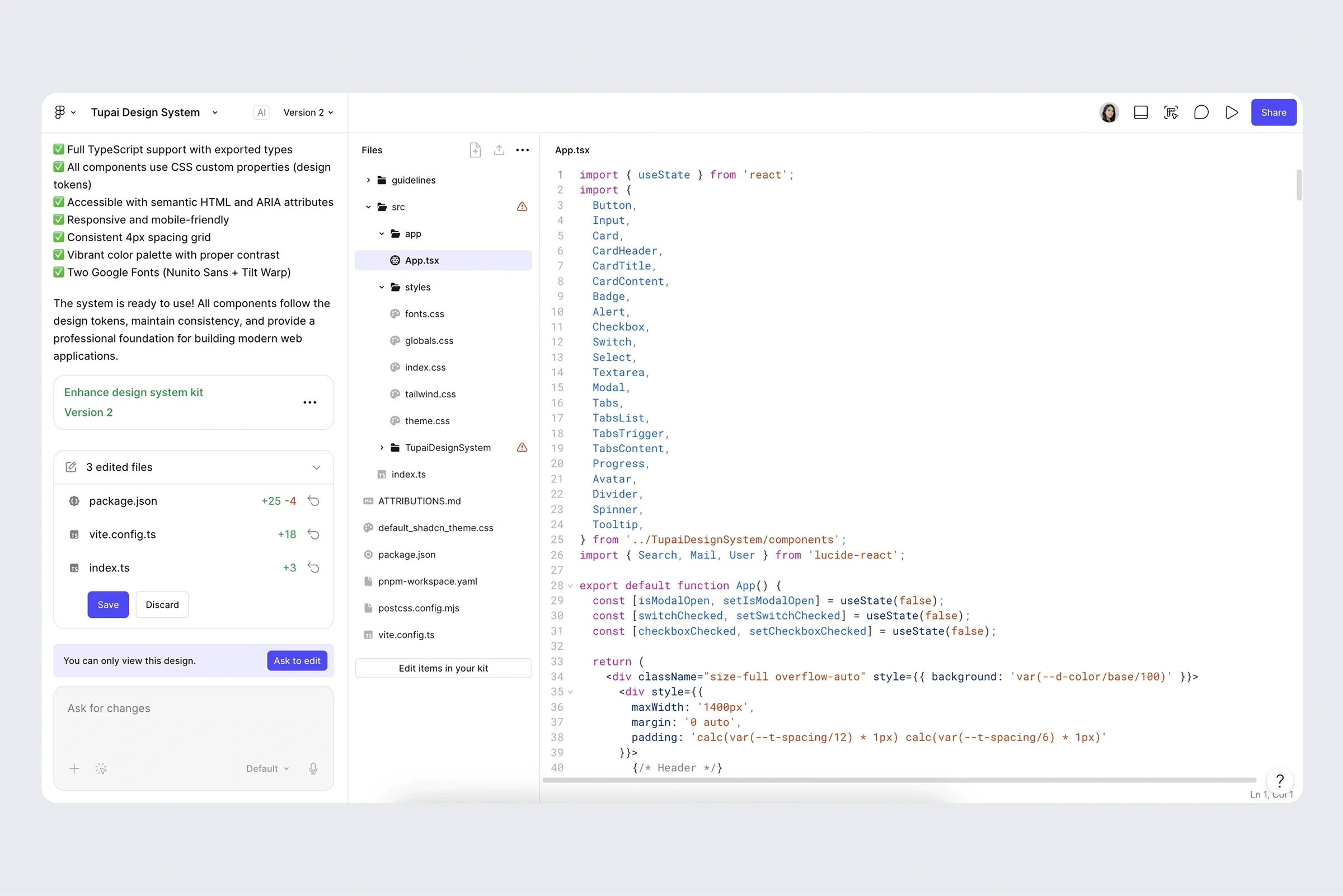
The design system was published to Tupai's Figma workspace and became the foundation for future product work.
Adoption quickly expanded beyond design. Product and engineering teams used the shared tokens and components to prototype and validate new ideas, reducing ambiguity and improving consistency.
One notable example was the Parent Portal initiative, where the Head of Product used the design system directly within Figma Make to assemble working interfaces using shared design tokens and components.

What started as a UI kit customisation project ultimately became a tool the wider team could use to design and ship products more efficiently.
REFLECTION
This project reinforced that design systems are not simply collections of component but are shared decision-making frameworks.
The most valuable outcome wasn't the number of components delivered, but the team's ability to work from a common foundation after the engagement ended.
It also highlighted the importance of involving engineering early. Some of the strongest decisions emerged through collaboration, ensuring the system remained both scalable and practical to implement.