Setel · 2020
A scaleable vehicle setup process for upcoming motorist features
Setel is the premier app enabling petrol customers to pay conveniently from their vehicle at over 1,000 PETRONAS stations in Malaysia. Besides earning Mesra loyalty points, customers can access promotions and redeem deals while refueling through Setel.
Timeline
1 month · Apr - May 2021
Team
Senior UI/UX Designer
Lead Designer
Developer
Responsibilities
UI designs
Prototype
How convenient store staff identifies users
Through Deliver2Me, petrol customers can now buy products from Mesra convenience stores directly from their vehicles while refueling. To place an order, users need to provide their license plate number, which identifies the order for Mesra store staff to deliver.

An opportunity presented by bottlenecks
Feedback was received from Mesra convenient store staff that they were having difficulties locating vehicles, leading to delivery delays. Meanwhile, Setel was expanding its motorist offerings and saw an opportunity to improve the vehicle setup process by providing more visual information about vehicles. The team also plans to repurpose this setup process for upcoming motorist features.
From vision to action
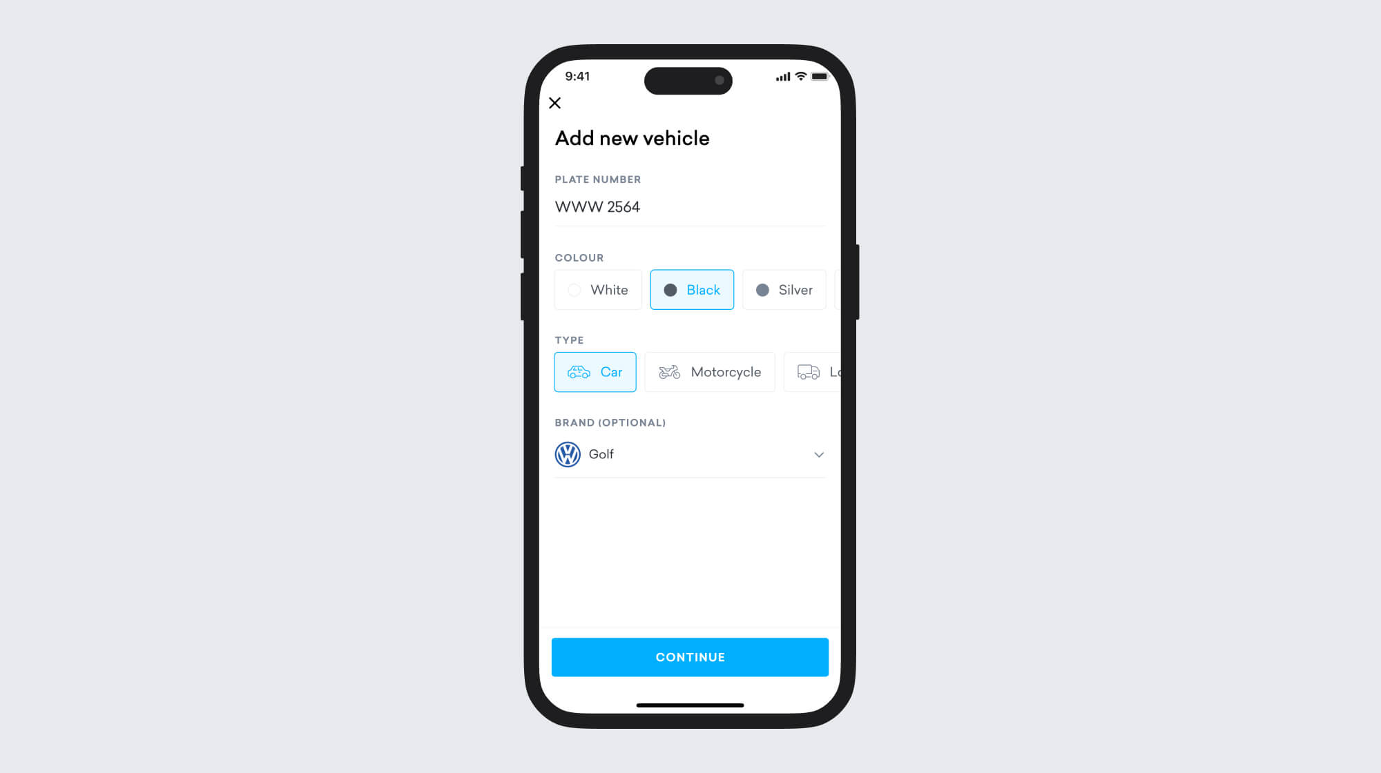
The team has chosen to include vehicle type, color, and brand and model (optional for the first release) for the upcoming features.
Understanding the landscape
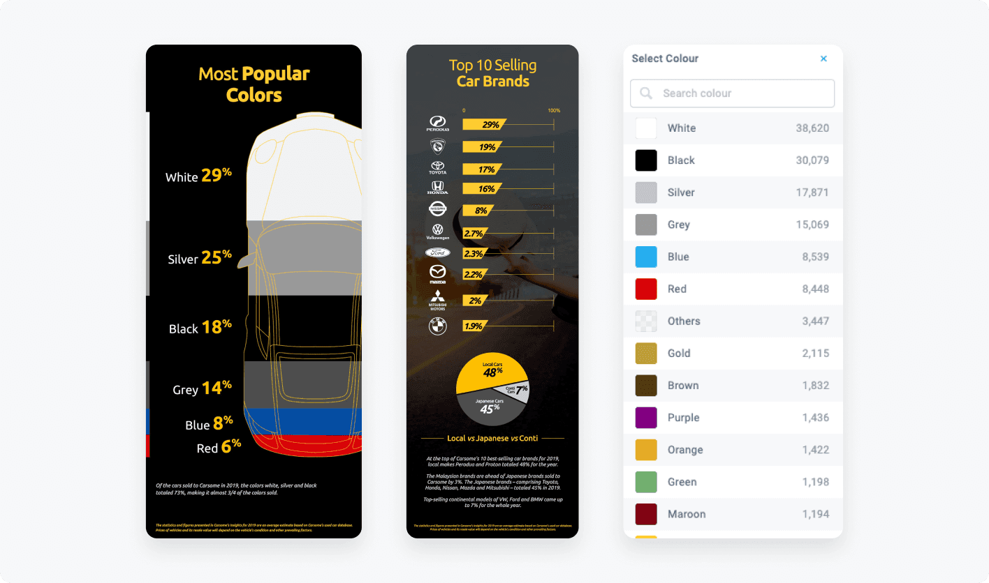
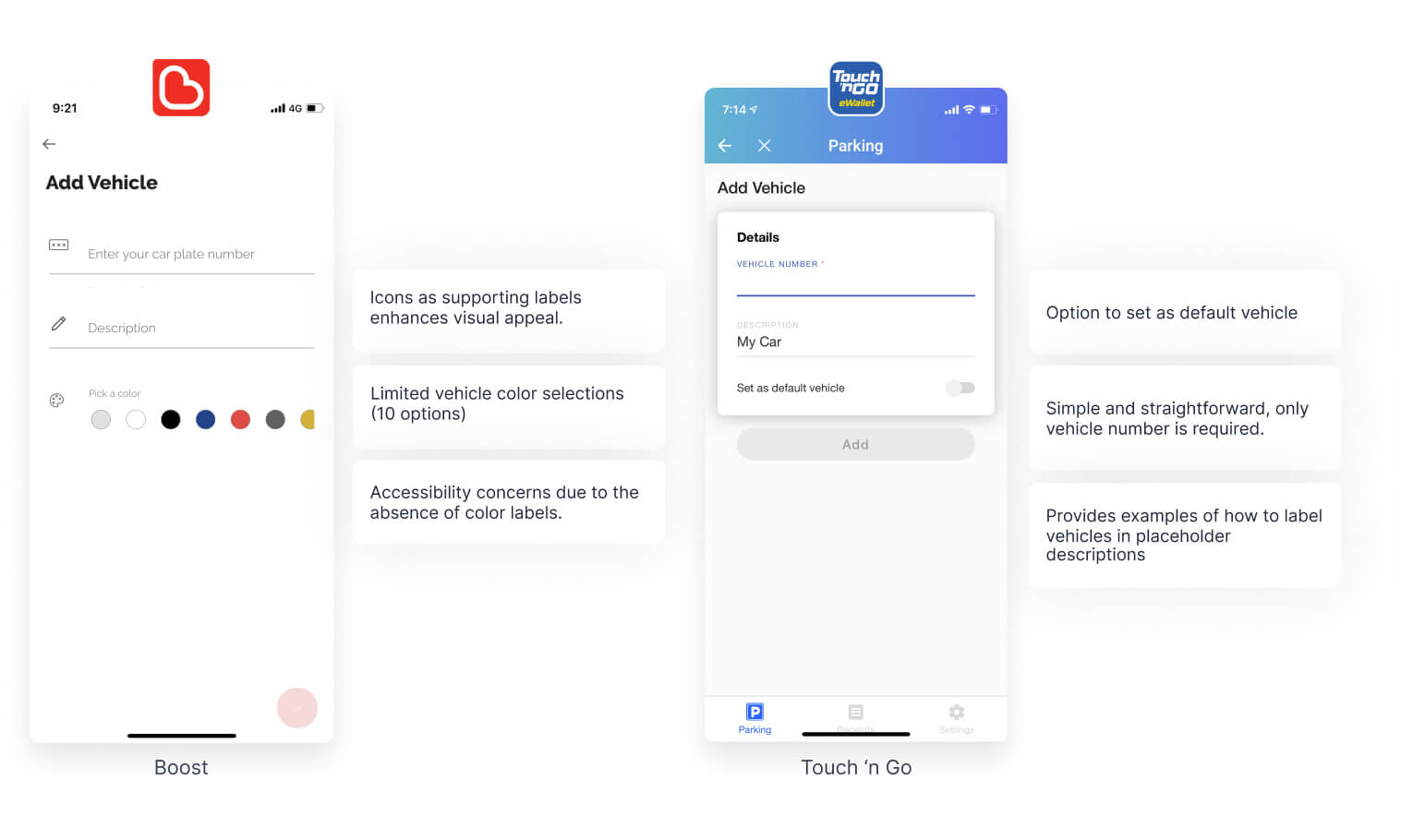
Before designing, I researched leading competitors in the vehicle space for insights on value proposition, layout, and features. Additionally, researching top car brands, models, and color schemes from top car e-commerce platforms in Malaysia has provided me with a good understanding of the most popular options.
Minimizing friction as our initial concept
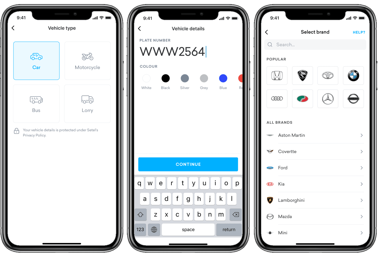
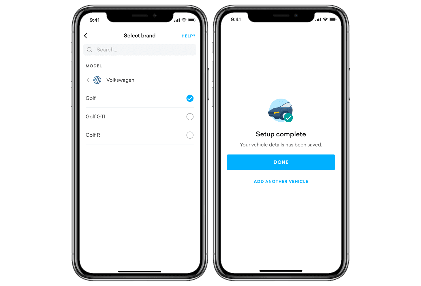
Our initial concept was to reduce friction during refueling by having users set up their vehicles beforehand, which was inspired by our conversations with senior designers. The preceding research and analysis informed our design, which put an emphasis on accessibility and convenience.

Making colors accessible
We know that not all users have the same level of familiarity or comfort with technology. This is particularly true when it comes to color options, where some users may have difficulty distinguishing between similar shades or hues. That's why it's essential to incorporate labels that provide clear descriptions of the color options, making it easier for users to select the one they want.

Speed up the search experience
By reordering the color options based on popularity, we can provide users with a more intuitive and seamless experience, where they can quickly find the color they want without having to search through a long list of options.
Making scalability a priority
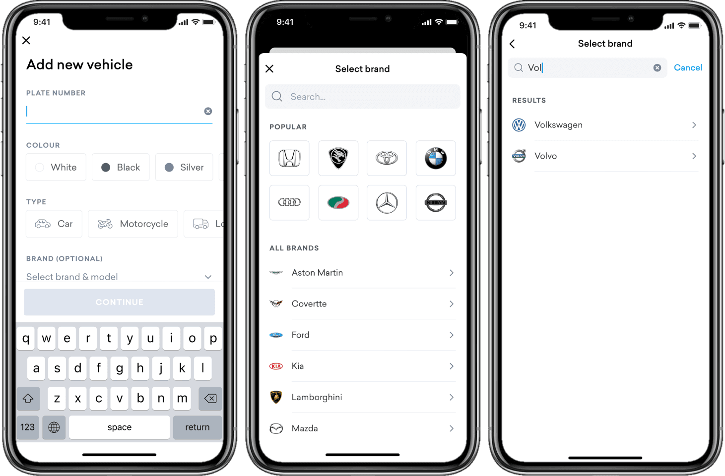
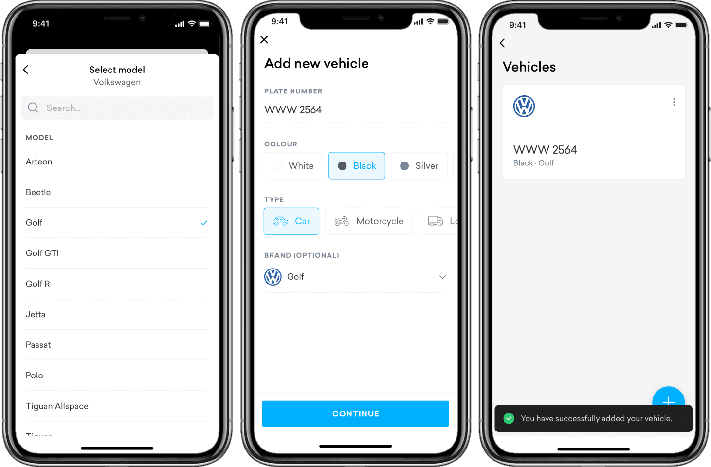
The initial concept sparked several debates within the team due to the excessive number of screens required to incorporate it with other features. Concerns were also raised about the development time required. These insights highlighted areas that needed reworking, and we placed scalability at the forefront of the next iteration. The iterated design combines all four fields into one page to reduce steps and seamlessly integrate the add vehicle feature with other motorist features, without making the setup process arduous.
Integrating with Deliver2Me
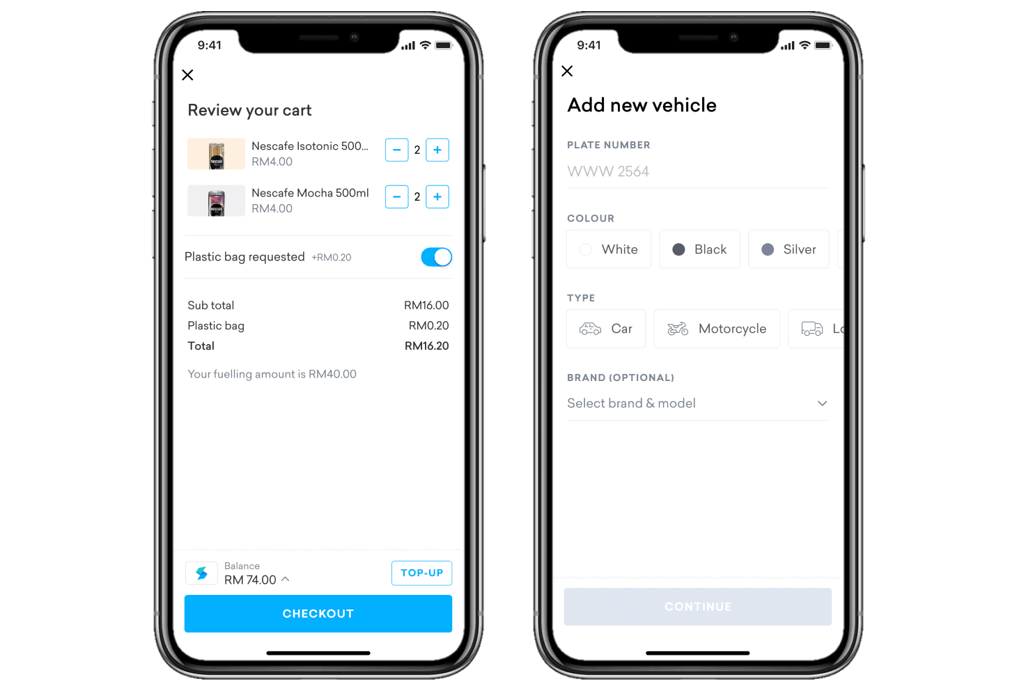
After aligning with the team, we agreed upon the iterated design, which caters to users with and without registered vehicles on their Setel account. Below are examples of use cases for both scenarios.

Challenges in retrieving brand info
To streamline the vehicle setup process, we chose to hide the brand field until the user selects a vehicle type. This ensures that users prioritize filling out the mandatory fields first and prevents confusion if they try to select the brand before choosing the vehicle type. Additionally, we made the brand field optional in the first release to reduce friction, but it can still be added later if needed.
What I have learned
Through this project, I've learned the significance of designing scalable solutions that can accommodate a range of scenarios and requirements, preventing the need for a complete redesign in the future. The experience has also highlighted the importance of collaborating with developers to ensure smooth implementation of features, avoiding any delays or complications.
