MySejahtera · 2021
Improving accessibility of information for a contact tracing app
MySejahtera, a Malaysian government-developed app, aids in controlling and handling COVID-19 outbreaks. It enables users to check-in at locations for contact tracing, locate COVID hotspots, discover healthcare facilities, and access various COVID-19 resources.
Timeline
10 days · Jun 2021
Team
Solo project · Design assessment
Responsibilities
User research
Design audit
UI designs
Prototype
Scope of assessment
I conducted a design audit, engaged in user research, identified key problems, and proposed design solutions to assist the government and nation in managing the COVID-19 situation.
New regulations catapulted MySejahtera's dominance
Starting August 10, 2021, premises can only serve customers with Low-Risk or Casual Contact status in MySejahtera. Fully vaccinated individuals across authorized states can now enjoy once-forbidden activities such as dine-in, non-contact sports, and tourism. In the face of evolving regulations and procedures, seamless access to vital information is essential for users to navigate their daily activities.
Users paved the way
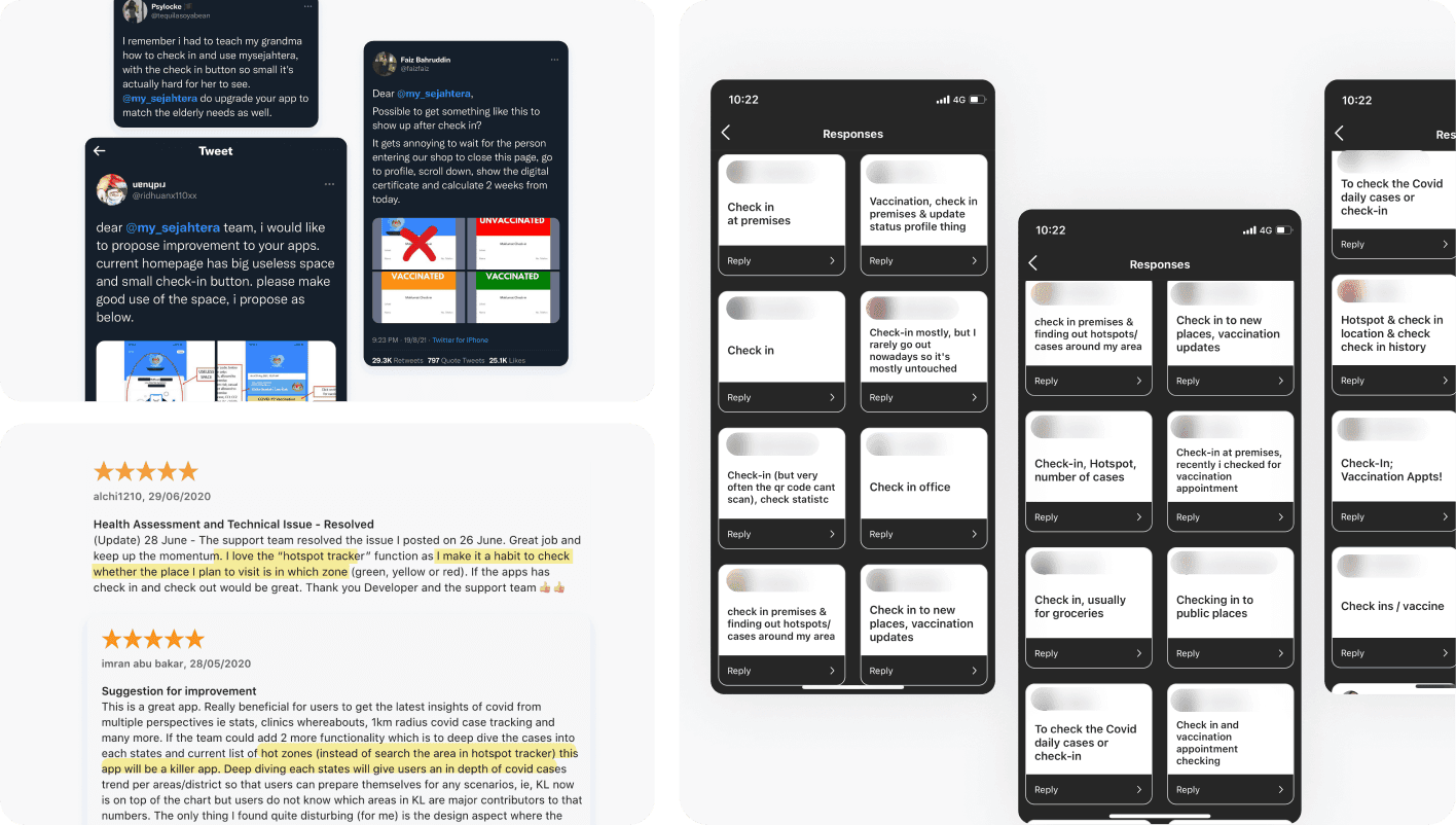
To expedite the process, I utilized social media's potential, opting for an Instagram survey (total 30 respondents) and collective insights from Twitter & app stores to unveil valuable discoveries, and shed light on prevailing pain points.
Grocery run unveiled deeper insights
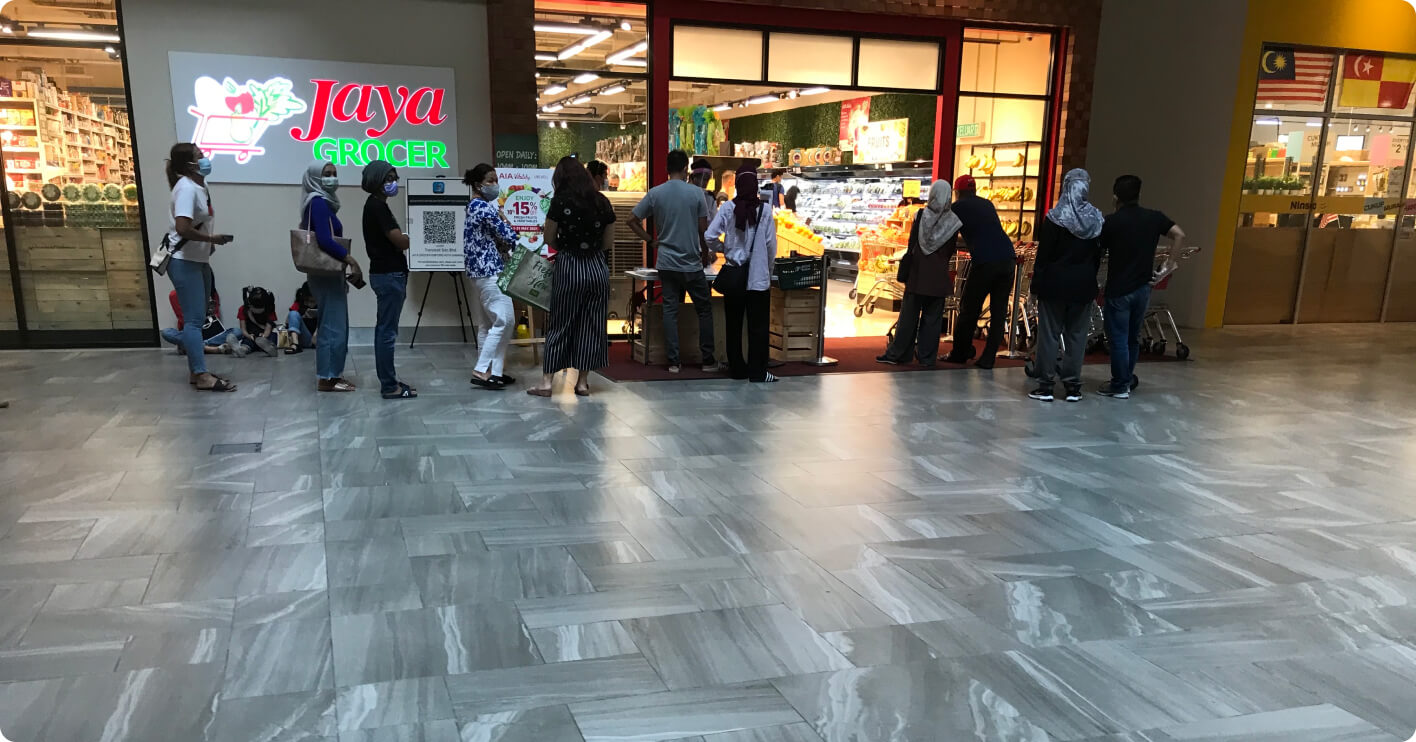
I closely observed users navigating the MySejahtera app before entering the store. I also witnessed 2 instances of unsuspecting users, oblivious to the need for presenting their risk profile status prior to QR code scanning. The repercussions were evident – queues stretched longer, testing the patience of all.
Defining the problem
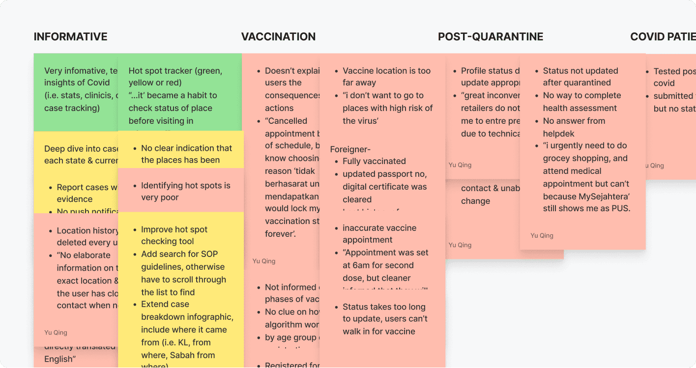
I identified a common theme and prioritised 3 recurring problems that consistently plagued users based on their impact and feasibility.
The check-in process is arduous and needs to be streamlined
While the Hotspot Tracker & Statistics feature is useful, it requires greater transparency in providing information
Critical information like vaccination appointments and regulatory guideline changes lacks timely updates
Question statement
I started brainstorming on how we might help users stay up-to-date & find the necessary information to help them make informed decisions. The list below outlines some of my design audits and suggested design changes aimed at enhancing the experience.
The check-in process is arduous
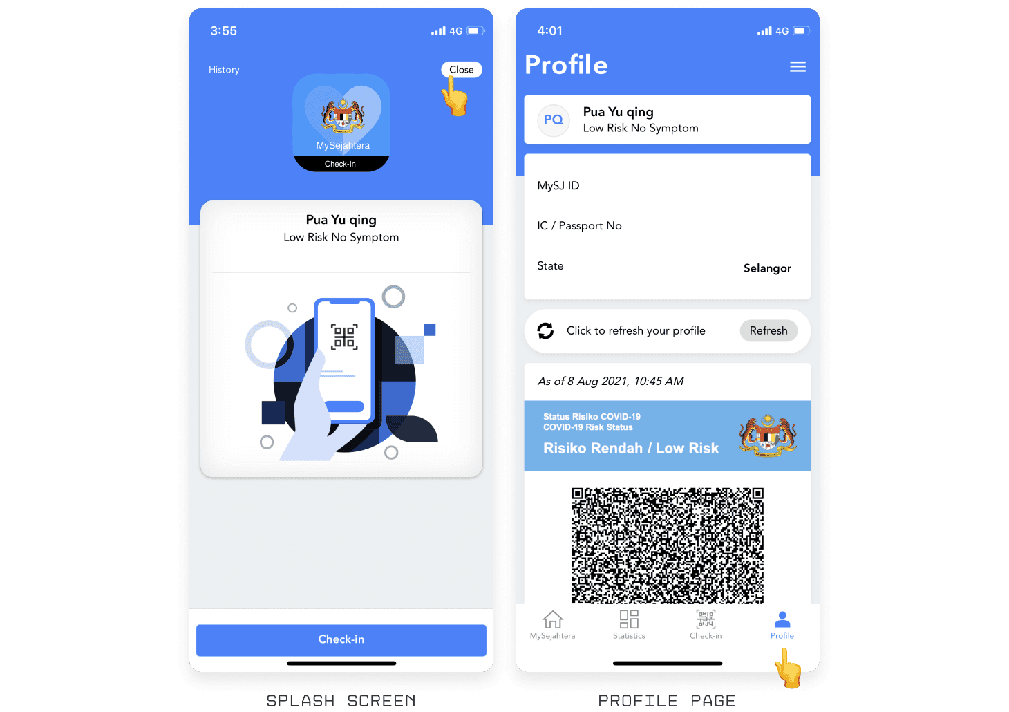
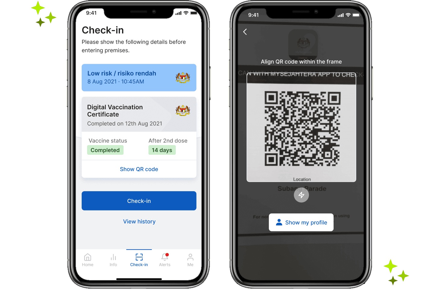
Users face the inconvenience of repeatedly switching between the Check-in and Profile tabs to display vaccine details before entering the premises, leading to frustration. Additionally, issues arise with the reachability of the close button and the placement of the check-in button, creating a disconnect within the page's layout.
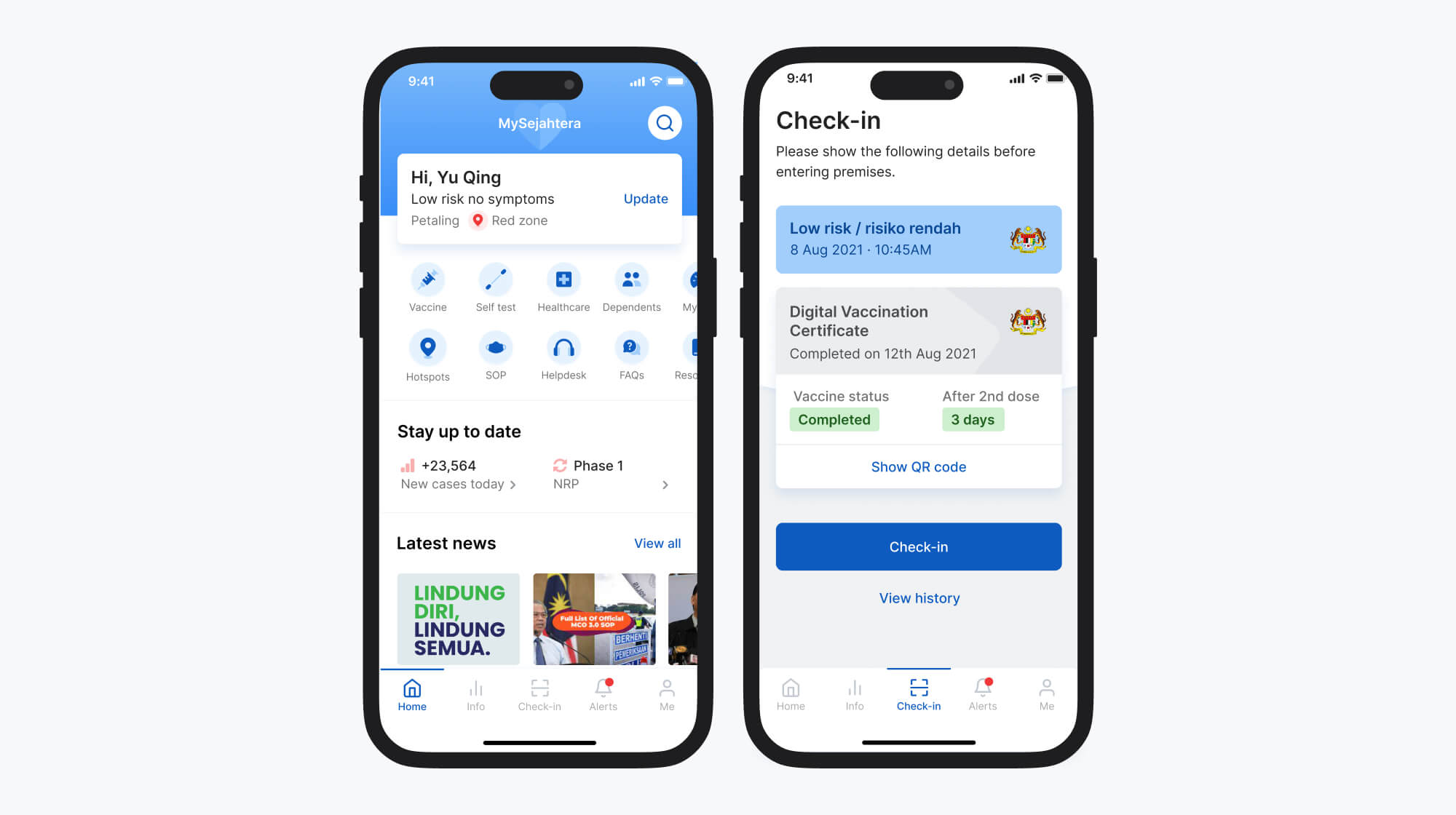
Reoptimized for swifter check-ins
The redesign focuses on minimizing the need for users to switch between pages to view vaccination information. By prominently displaying the risk status and vaccination status upfront, not only does it optimize the screen space, but it also enables users to enjoy a seamless and expedited entry process.
Problems on the home page
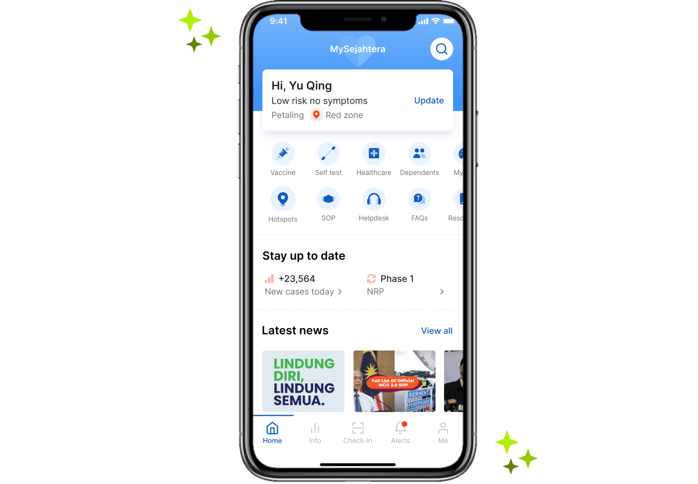
The feature menu contains numerous duplicating phrases (i.e. COVID-19) and misleading titles. Additionally, important resources are concealed within the 'more' section, potentially leaving users unaware of their existence. The main feed lacks informative value and could be better utilized by offering ministry guides and the latest SOP updates for a more purposeful user experience.

Increasing the visibility of information
The core objective of this redesign is to enhance the accessibility and comprehensibility of information. The homepage provides an excellent opportunity to swiftly update users with essential information, offering a convenient glance at pertinent details.
Taking in insights is difficult
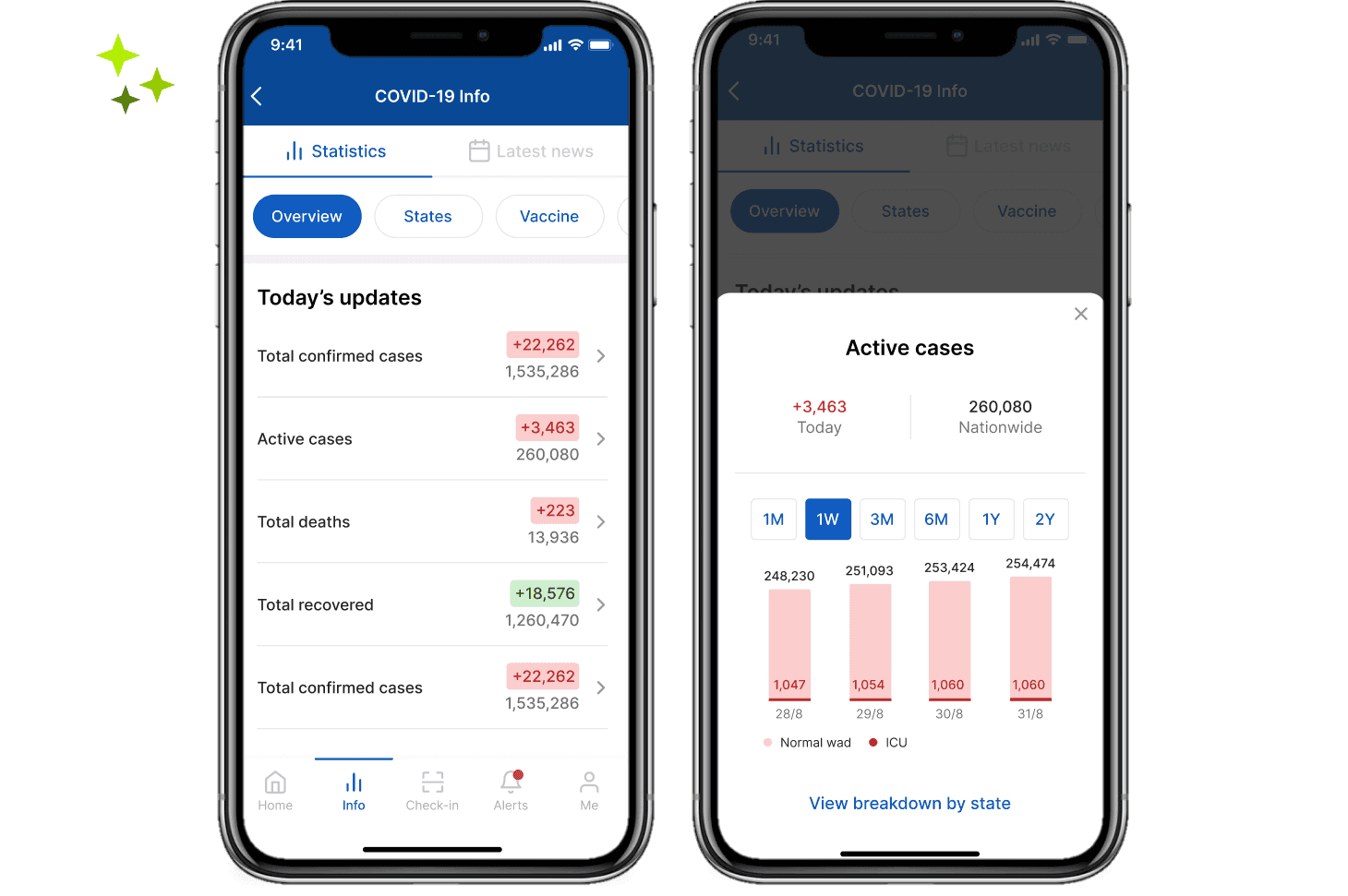
Users are left without detailed information regarding case locations, hindering their awareness and preparedness. Additionally, the absence of metrics displaying case trends by district further limits their understanding. From a visual standpoint, the excessive color contrast presents legibility challenges, while improvements to the hierarchy of values could enhance the overall user experience.

Optimized for digestibility
The redesign's objective is to assist users in swiftly understanding relevant statistical updates and easily interpreting trends. Metrics have been restructured and color-coded for digestibility. Additionally, this proposal incorporates an option to view state-specific case breakdowns, though feasibility is a concern.
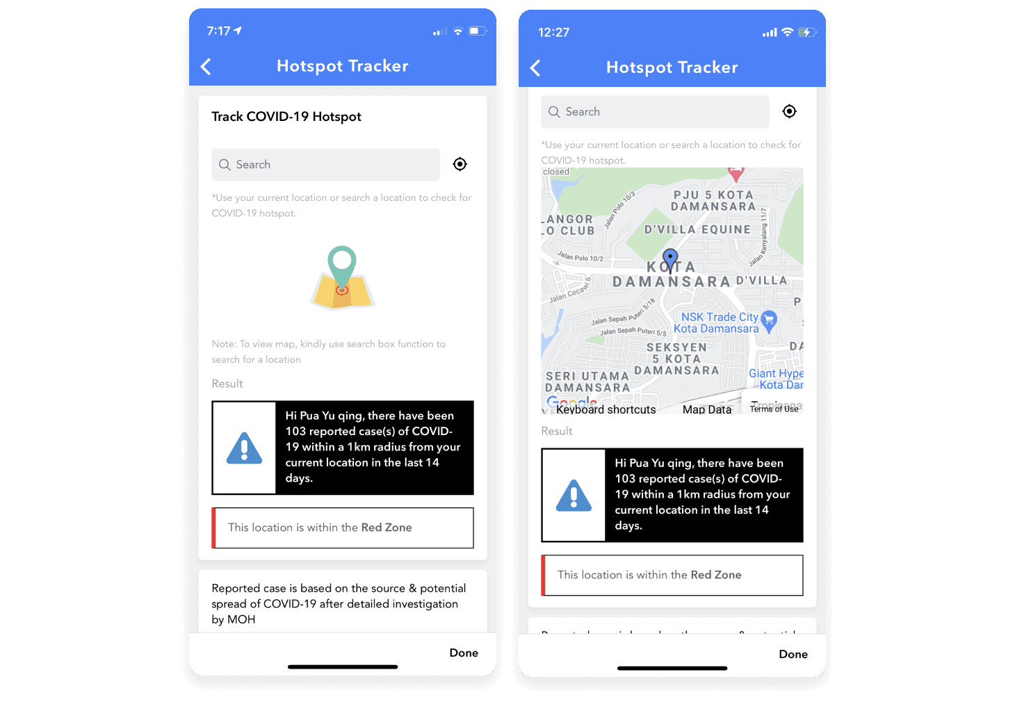
Issues with visual hierarchy
The page's visual hierarchy can be adjusted to optimise content presentation. The initial scan of the reported case count is challenging due to dense text and inadequate contrast. Furthermore, there is a lack of information regarding reported cases by location.
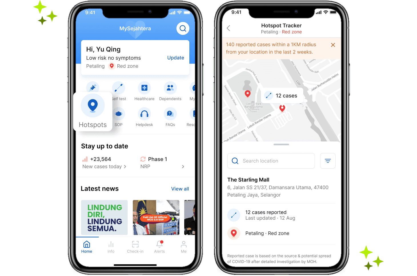
Enhanced case awareness
The real-time hotspot tracker enables users to explore nearby cases, utilizing color-coded pins to identify risk zones. It provides a detailed breakdown with time stamps to verify the recency of updates, enhancing user understanding of the situation.
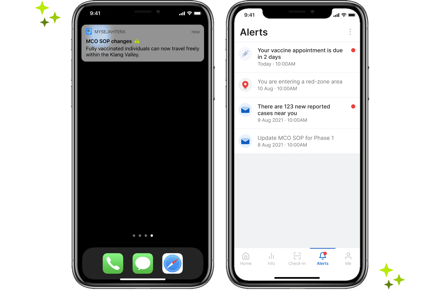
Keeping users informed
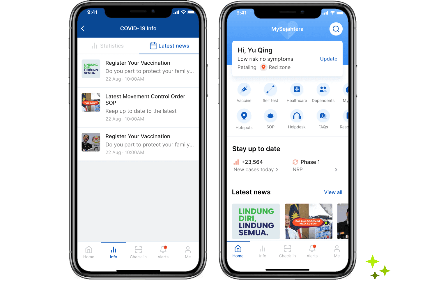
Addressing the app's current lack of timely updates during challenging times, this proposal aims to tap into the opportunity of easing user discomfort. The notification page will serve as a centralized hub, providing crucial news on ministry guideline changes, vaccination updates, and high-risk zone alerts to keep users well-informed.
Prototype
You can view the full prototype here.
Retrospective
The MySejahtera team has clearly put a lot of effort into creating an app that can help fight and prevent COVID-19, especially in these challenging times. I have a lot of respect for their hard work.
Redesigning the MySejahtera app within the given time frame was also a real challenge and a learning experience. The design proposals I have shared above haven't been tested yet and more user testing needs to be conducted to make sure these changes work well.
